Staring at paint swatches on your kitchen table can feel overwhelming. You want a home decor color palette that feels like you, not a showroom. So, where do you even begin? Brown Interiors has guided Pearland homeowners through this choice for 30 years. We know the right palette changes how a house feels the moment you walk in. Our interior design services start with the same question every client asks first.
That question matters more now than ever. Homeowners are spending more time at home, and their color choices show it. In fact, a recent home improvement trends guide from Forbes points to color as a top design priority this year. This guide walks you through picking a color scheme that flows from room to room. You’ll learn how to test colors, avoid common mistakes, and match tones to your mood. Then, call 281-412-5305 when you’re ready for expert color guidance. Every tip here comes from real design work across Houston-area homes.
1. Why Your Home Decor Color Palette Matters
2. Discovering Your Personal Color Style
3. Building a Cohesive Color Scheme Room by Room
4. Common Color Palette Mistakes to Avoid
5. Choosing Paint, Fabric, and Accent Colors
6. Working With a Color Consultation Expert
Why Your Home Decor Color Palette Matters
Every home tells a story through color. Your color palette sets the tone before anyone reads a single detail. But most people pick single colors instead of planning a full palette, and that’s the first habit to break.
A strong color palette ties your entryway, living room, and kitchen into one story. It also shapes your mood every day you’re home. If your Pearland house was built before 1978, check the lead paint safety guidelines before you sand or scrape old trim.
Start With Your Home's Existing Tones
Look at what you already have before buying paint. Your flooring, trim, and cabinets set real limits on any color palette. Warm wood tones pull toward warm colors, while cool tile pulls the other way. So, walk each room and note what stays before you shop for anything new.
Match Your Palette to Natural Light
Light changes color more than people expect. A soft blue can look gray in a room that gets little sun. Then, that same blue turns bright and fresh in a sunny room. Test paint swatches at different times of day before you commit. Also, hold swatches next to your windows, not under store lighting. Most homeowners skip this step and regret it later.
Key Takeaway: Your home decor color palette works like a thread that runs through every room. Start by studying your home’s fixed features, then test colors in real daylight. Skip this step, and even a beautiful color scheme can feel disconnected from room to room.
Discovering Your Personal Color Style
Your palette should feel like you, not a passing trend. So, start with colors you already love. Look at your closet, your favorite art, or a photo that makes you smile. Notice which colors show up again and again, since that pattern points to your true color style.
A personalized design consultation can turn that instinct into a full color scheme. Our designers ask about mood first and colors second, because the feeling always comes before the shade.
Define the Mood for Each Room
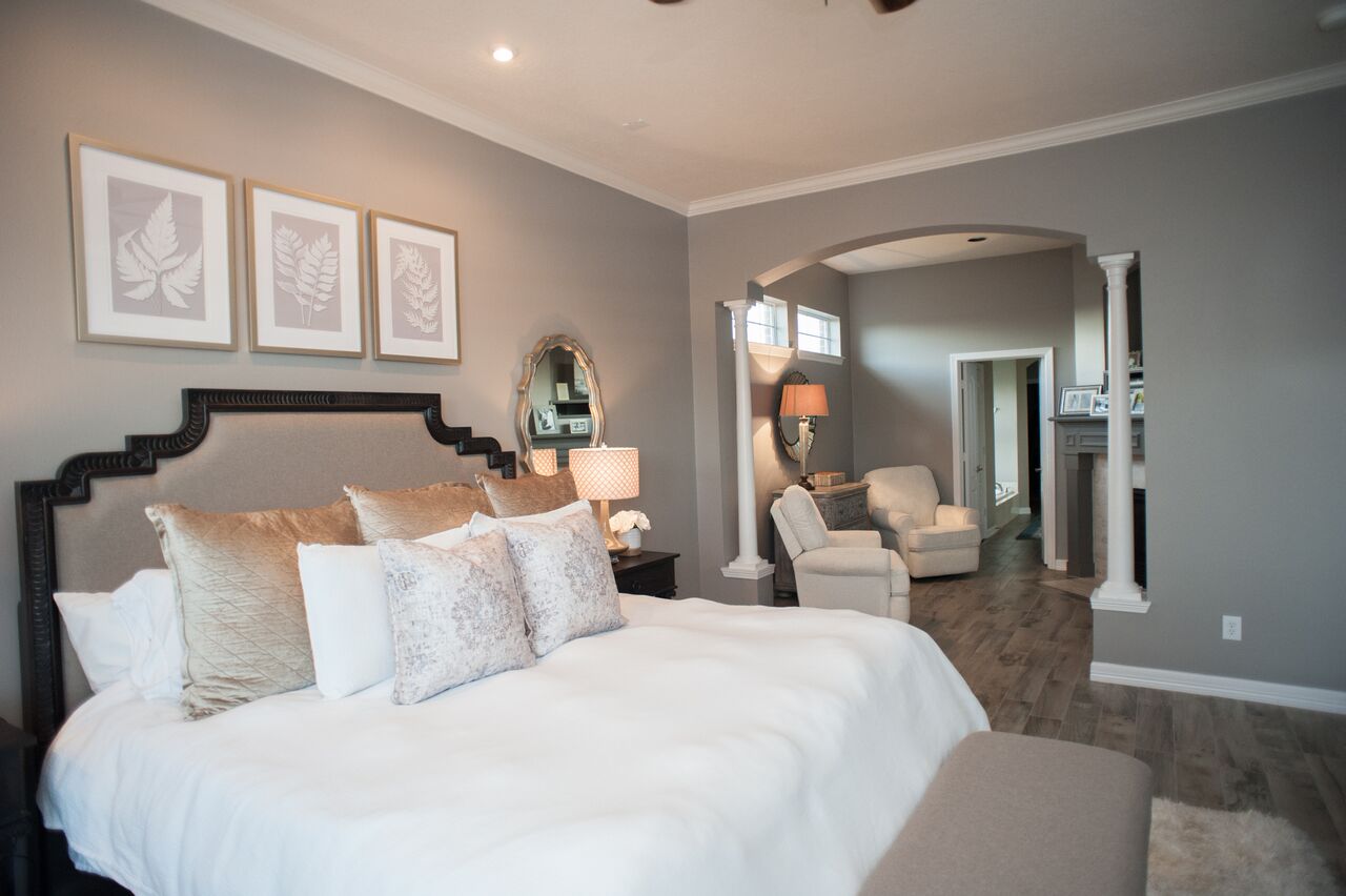
Every room needs its own job to do. A bedroom usually wants calm, muted colors that help you unwind. A kitchen can handle brighter, energetic tones since it’s a gathering space. Write down one mood word per room before you pick a single color. This small step keeps your whole color palette purposeful instead of random.
Test Colors Before You Commit
Paint a large swatch directly on your wall, not just a small square. Live with it for several days before deciding. Look at it with the lights on and off. This habit catches problems early, long before you’ve bought gallons of the wrong color palette.
Building a Cohesive Color Scheme Room by Room
A cohesive color scheme doesn’t mean matching every wall. It means every room speaks the same visual language. Pick one anchor color, then let each room shift it lighter or darker. This keeps your color palette flexible, not flat, so your kitchen can feel bright while your bedroom stays soft.
Americans are spending more time inside their homes than ever, based on housing trends data from the Census Bureau. That makes a connected color scheme worth the extra planning.
Choose Your Anchor Color First
Pick your anchor color before anything else. This is the color you’ll see most, on walls or big furniture. Then, add two supporting colors at smaller doses. Most of the room stays in one color, less in a second, and a small accent in a third. This keeps your color scheme balanced instead of busy.
Carry Color Through Every Hallway
Hallways trip up most color palette plans. They connect rooms with different moods, so pick a neutral that works with both. A warm white or soft greige often bridges bold and calm rooms well. Also, keep your trim color consistent throughout the home. This small choice makes your whole color scheme feel planned.
Pro Tip: Paint a poster board sample and move it room to room before committing. A color that looks perfect in your living room can shift completely under your bathroom lighting. This five minute test saves you from buying gallons of the wrong color palette twice.
Common Color Palette Mistakes to Avoid
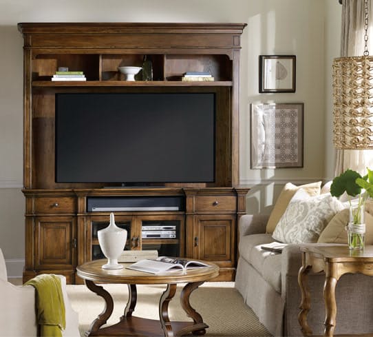
Even careful homeowners make color palette mistakes. Most come from rushing or skipping a real test. Here are the slip ups we see most often in Pearland homes. Our Tree House project shows what happens when a palette gets tested and layered the right way. Notice how every room shares tone without repeating the same color.
Skip Colors Chosen From a Screen
Screens shift color more than most people realize. A blue that looks navy on your phone can look almost black in person. So, always confirm with a real paint chip or sample pot. This one habit prevents most color palette regrets before they happen.
Watch for Hidden Paint Undertones
Every color hides an undertone. White paint can lean pink, yellow, or gray. Those hidden tones clash fast when placed side by side. Hold samples together in daylight to catch clashing undertones early. This step protects your entire color scheme from an awkward mismatch.
Common Mistake to Avoid: Common mistake: choosing every color separately, room by room, without a plan. This creates a home that feels disconnected from hallway to hallway. Instead, build your full color palette first, then apply it room by room. The order matters more than most homeowners expect.
Choosing Paint, Fabric, and Accent Colors
Paint is only one piece of your color palette. Fabric, rugs, and art carry color too, often more than walls do. Balance these layers so no single piece fights for attention. Most importantly, choose fabrics before final paint, since fabric options are harder to match later.
Homeowners planning a longer stay can check homeownership resources for broader home planning guidance. Then, build your wall color around those fixed fabric choices.
Layer Texture With Your Colors
Texture changes how a color reads on the wall. Matte paint softens a bold color, while gloss makes it pop. Linen and wool add warmth even to a cool color scheme. Mix textures the same way you mix colors, with intention behind every choice.
Save Bold Shades for Accents
Bold colors work best in small doses. A deep green door or a rust throw pillow adds punch without overwhelming a room. This keeps your color palette flexible as trends change. You can swap accents in an afternoon instead of repainting a whole room.
What This Means for You: You don’t need to get every color decision perfect on day one. Start with your anchor color palette, add fabric and texture, then layer in bold accents last. This order protects your budget and your walls. If a color scheme ever feels off, the accent pieces are the easiest and cheapest layer to change first.
Choosing the right home decor color palette takes patience, not perfection. Start small, test often, and trust the colors that make your home feel like you. Every tip in this guide comes back to one idea: a strong color palette connects every room instead of isolating each one. So, walk through your home again with fresh eyes. Notice the colors that already work, and build from there. In short, small consistent choices beat one dramatic splurge every time.
Ready to bring your color palette to life? Explore color options with Brown Interiors’ color consultation service, and call 281-412-5305 to talk through your palette preferences with our team. You can also shop home decor accents that complete your new home decor color palette today. Your home deserves a palette built around how you actually live. Most importantly, a color scheme should make your home feel calm, not chaotic. That’s the real goal of every color palette we help create.
Expert Insight from Brown Interiors' Design Team: After 30 years of design work across the Houston area, we’ve learned one thing above all: color decisions people regret are almost always made too fast. Homeowners grab a favorite shade from a magazine and paint before testing it in their own light. We always tell clients to slow down, sample first, and build a palette that works for the whole home, not just one room.
Key Takeaway: Choosing a home decor color palette comes down to three moves: study your fixed features, test real swatches in real light, and keep every room connected to one story. Skip trends that don’t fit your life. A color scheme built this way looks intentional now and still feels right years from now.
Frequently Asked Questions
What is a home decor color palette, and why does it matter?
A home decor color palette is the set of colors you use across your home. It matters because it ties every room together. So, a clear color palette makes your whole house feel planned instead of random from room to room.
How many colors should I use in a color palette?
Most homes work well with three to five colors total. Use one anchor color, two supporting colors, and one or two accents. This keeps your color palette simple and easy to repeat throughout every room in your home.
What's the easiest way to pick a color scheme for my whole house?
Start with one item you already love, like a rug or a favorite painting. Pull three colors from it to build your color scheme. Then, test those colors in real daylight before you buy any paint.
How do I match my color palette to my home's lighting?
Test paint samples in your actual rooms, not under bright store lights. Check them in the morning, midday, and evening light. Your color palette should look good at every hour, since natural light shifts color throughout the day.
Should every room share the same color palette?
Not exactly the same shade, but every room should relate to the rest. Keep one shared color palette as your base, then adjust the tone by room. A bedroom can feel softer while a kitchen stays brighter within that same color scheme.
Step-by-Step Process
Step-by-Step Home Decor Color Palette Process
1. Gather color inspiration from photos you love
2. Pick one anchor color for your whole home
3. Add two or three supporting palette colors
4. Test real paint swatches on your walls
5. Check colors in morning, noon, and evening light
6. Match your palette to flooring, cabinets, and trim
7. Assign a mood to each room’s color
8. Order full size samples before buying gallons
9. Live with samples for at least a week
10. Book a color consultation to confirm your palette
Quick Reference: What Is a Home Decor Color Palette?
A home decor color palette is the group of colors you choose to use throughout your home. It usually includes one main color, two or three supporting colors, and a small accent shade. Good palettes also account for lighting, texture, and the fixed features already in a room, like flooring or cabinets. So, a strong color palette isn’t random. It follows a plan that connects every room while still letting each space have its own mood. Designers often build this plan around one anchor color first, then layer the rest around it.
Additional Resources
Browse our design inspiration blog for more room by room color ideas, styling tips, and real project stories from Pearland area homes.
See how a full color story comes together in our Mexico House feature, where warm tones and layered textures shape every connected room.
Our Bootstrap Foundation feature shows how a considered color scheme can transform a space with character while keeping every choice practical.
Read our Women in Business feature to see how thoughtful color choices shape spaces that reflect real personality and local style.
By Deborah Brown, Founder & CEO / Lead Designer · Updated